How to Design Your Pitch Deck
Jan 05, 2023You want your deck to look amazing. Your deck’s design shows how much you care about impressing investors. Here's how to do it. It's a classic case of less is more...
1. Invest in great design
- Your deck needs to project the image of a successful founder and business.
- Depending on how much you are asking from investors, each slide might generate between £10,000 and £50,000 in funding. Invest a little money to give them the creative polish they need.
- Resist the temptation to show off your PowerPoint skills. Use design tools like figma or canva. If you invest in a designer, get a designer who does pitch decks.
2. Favour minimalist design

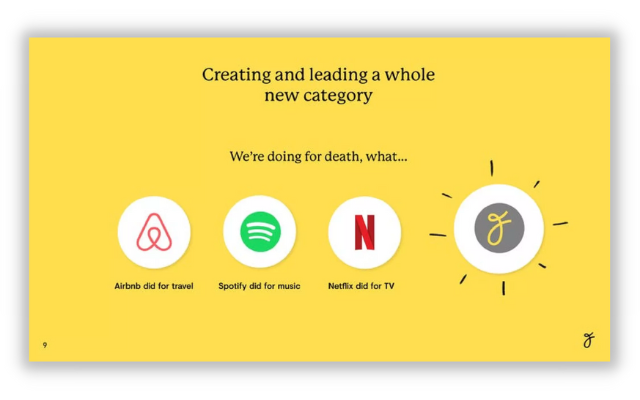
Good minimalist design
- The design is there to gently amplify your story, which explains why investors should be excited about the chance to invest in your business.
- Design should not compete for or distract attention. There are no art prizes to be won. Keep it clean, with light coloured backgrounds and a couple of colours to add texture.
- Use your logo, but you don’t need additional brand flourishes or unnecessary imagery.
- Icons should be consistent, meaningful and used sparingly.
3. Let your story drive every creative decision
- Your deck design brings your content to life to tell your story visually. It’s hard to do this with assets that were created for another reason.
- Resist the temptation to use your standard template or re-use existing images, charts, and diagrams.
- Create as much as you can from scratch, based on your investment story. What illustrates, amplifies or proves your big point on each slide?
4. Avoid clutter

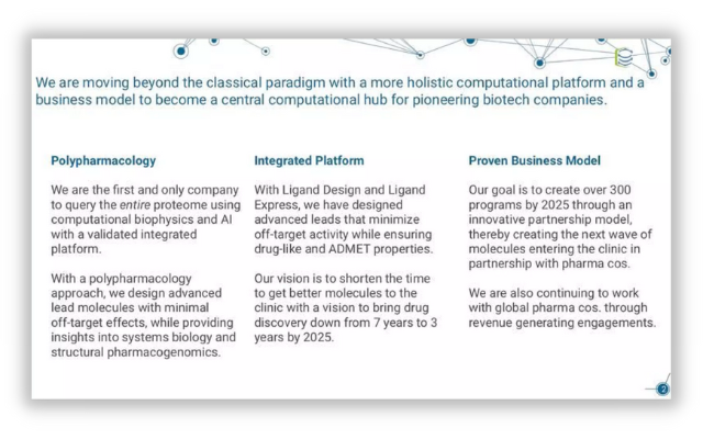
Spot the clutter
- Tell your story as simply as you can. Don’t feel you have to fill every space or cram in visual stimulus.
- You’re offering investors the equivalent of a tasteful side salad, not a fully loaded Double Whopper with extra bacon and cheese.
- Take out whatever imagery and design elements that can be removed to make the deck more easily digestible.
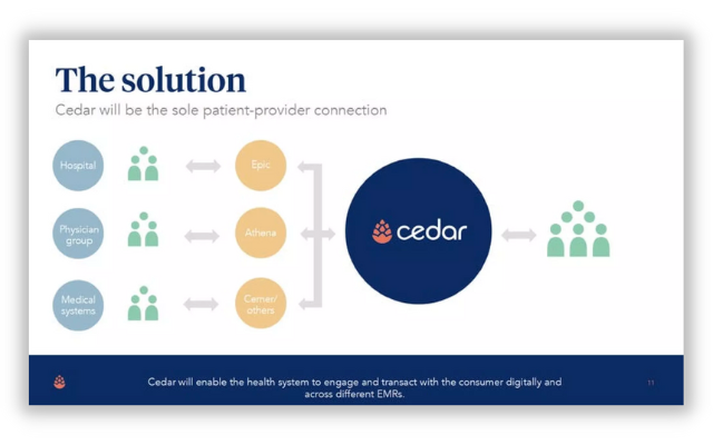
5. Charts and diagrams should speak for themselves

- Investors love charts, the simplest form of data storytelling. They should be clear and easily understood.
- Diagrams are supposed to simplify and explain. They should not be complex and need explaining.
- Test all your visual assets to see if they work without any supporting words. If they don’t, work on the visuals before you put words back in. Ideally, you won’t need them anymore.
6. Make sure they can read it from the back of the room
- You want all your points to be clearly legible. That means a font size of 30–40.
- You want your sub-titles to be bigger.
- You want your slide titles to be bigger still.
- Large font sizes make it easier for investors to quickly scan, which is their preferred mode of reading. Big fonts also reduce the amount of words you can include per slide, which forces you to be concise and punchy.
7. Make your deck easy to receive and work with
- Your deck is essentially a digital handout. Don’t try to make it interactive. Videos, demos, and any links (beyond your website) are best shared later, when you have investor attention.
- Most decks are shared in PDF format. Keep an eye on file size, so it doesn’t become too large to easily share by email.
- You can also use a document sharing system to see who views it.
- Resist the temptation to password protect your deck. We know it’s full of secret information, but you have to trust investors to treat it confidentially. Anything that creates extra faff will just annoy them.
Summary
Here’s what you need to know:
- Invest in great design
- Favour minimalist design
- Let your story drive every creative decision
- Avoid clutter
- Charts and diagrams should speak for themselves
- Make sure they can read it from the back of the room
- Make your deck easy to receive and work with
Whenever you're ready...
There are three ways we can help you:
1. Get free actionable advice in your inbox every fortnight.
2. Get your pitch deck reviewed by an experienced entrepreneur or investor.
3. Create a winning pitch deck within a week with our online course. It gives you the insider knowledge we learned helping start-ups that raised over $1bn.

